Automated Graphical Data Analysis with brinton
Pere Millán-Martínez & Ramon Oller Piqué
2022-12-29
Source:vignettes/brinton.Rmd
brinton.RmdNOTE: This vignette a short version, with the necessary updates, of the original article A Graphical EDA Tool with ggplot2: brinton published by The R Journal:
@article{RJ-2021-018,
  author = {Pere Millán-Martínez and Ramon Oller},
  title = {{A Graphical EDA Tool with ggplot2: brinton}},
  year = {2021},
  journal = {{The R Journal}},
  doi = {10.32614/RJ-2021-018},
  url = {https://doi.org/10.32614/RJ-2021-018},
  pages = {311--320},
  volume = {12},
  number = {2}
}
Introduction
We created brinton library to facilitate exploratory
data analysis following the visual information-seeking mantra: “Overview
first, zoom and filter, then details on demand”. The main idea is to
assist the user during these three phases through four functions:
wideplot(), matrixplot(),
longplot() and plotup(). While each of these
functions has its own arguments and purpose, all four serve to
facilitate exploratory data analysis and the selection of a suitable
graphic.
The library can be installed easily from the Comprehensive R Archive Network (CRAN) using the R console. When the library is loaded into memory, it provides a startup message that pays homage to Henry D. Hubbard’s enthusiastic introduction to the book Graphic Presentation by Willard Cope Brinton in 1939:
install.packages('brinton')
library(brinton)
## M a G i C i N G R a P H SThe specimens
The wideplot(), matrixplot() and
plotup() functions include arguments that allows the user
to nominally plot specific graphics. The names and an example of each
type of graphic are shown in the 1v specimen and
2v specimen vignettes dedicated to graphics that requiere
one or two input variables. These graphics serve as an example so that
the user can rapidly check whether a graphic has been incorporated, the
type or types of variable for which it has been incorporated, and the
label with which it has been identified. The suitability of a particular
graphic will depend on the datasets of interest and the variables of
each particular user.
In order to keep the package as compact as possible, these vignettes are not built whithin the package but they can be found at sciencegraph.github.io/brinton/articles/.
brinton’s functions
The wideplot() function allows the user to explore a
dataset as a whole using a grid of graphics in which each variable is
represented through multiple graphics. Once we have explored the dataset
as a whole, the longplot() allows us to explore other
graphics for a given variable. This function also presents a grid of
graphics, but instead of showing a selection of graphics for each
variable, it presents the full array of graphics available in the
library to represent a single variable. Once we have narrowed in on a
certain graphic, we can use the plotup() function, which
presents the values of a variable on a single graphic. We can access the
code of the resulting graph and adapt it as needed. These three
functions expand the graphic types that are presented automatically by
the autoGEDA libraries in the R environment.
The wideplot function
The wideplot() function returns a graphical summary of
the variables included in the dataset to which it has been applied.
First it groups the variables according to the following sequence:
logical, ordered, factor,
character, datetime, numeric.
Next, it creates a multipanel graphic in html format,
in which each variable of the dataset is represented in a row of the
grid, while each column displays the different graphics possible for
each variable. We called the resulting graphic type wideplot because it
shows an array of graphics for all of the columns of the dataset. The
structure of the function, the arguments it permits and its default
values are as follows:
wideplot(data, dataclass = NULL, logical = NULL, ordered = NULL,
  factor = NULL, character = NULL, datetime = NULL, numeric = NULL,
  group = NULL, ncol = 7, label = 'FALSE')
The only argument necessary to obtain a result is data
that expects a data-frame class object; ncol
filters the first n columns of the grid, between 3 and 7, which
will be shown. The fewer columns displayed, the larger the size of the
resulting graphics, a feature that is especially useful if the scale
labels dwarf the graphics area; label adds to the grid a
vector below each group of rows according to the variable type, with the
names and order of the graphics; logical,
ordered, factor, character,
datetime and numeric make it possible to
choose which graphics appear in the grid and in what order, for each
variable type. Finally, group changes the selection of
graphics that are shown by default according to the criteria of the
table 1.
The wideplot() function takes inspiration from this
function, but instead of describing the dataset in textual or tabular
form, it does it graphically (see figure 1). We can easily compare the
results of these two functions, for example, with the dataset esoph from
a case-control study of esophageal cancer in Ille-et-Vilaine, France.
The dataset has three ordered factor-type variables and two numerical
variables:
str(esoph)## 'data.frame': 88 obs. of 5 variables:
## $ agegp : Ord.factor w/ 6 levels "25-34"<"35-44"<..: 1 1 1 1 1 1 1 1 1 1 ...
## $ alcgp : Ord.factor w/ 4 levels "0-39g/day"<"40-79"<..: 1 1 1 1 2 2 2 2 3 3 ...
## $ tobgp : Ord.factor w/ 4 levels "0-9g/day"<"10-19"<..: 1 2 3 4 1 2 3 4 1 2 ...
## $ ncases : num 0 0 0 0 0 0 0 0 0 0 ...
## $ ncontrols: num 40 10 6 5 27 7 4 7 2 1 ...
wideplot(esoph)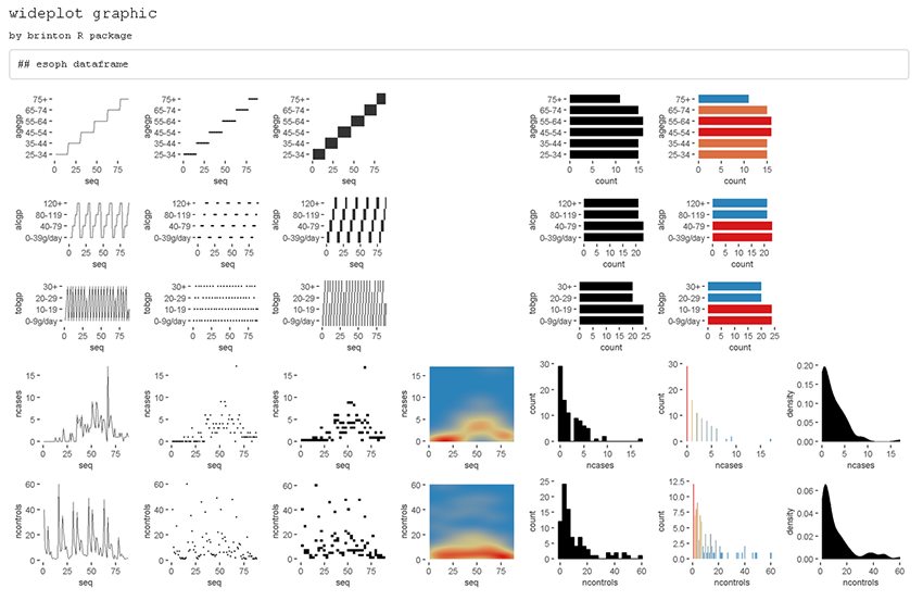
Figure 1
If the order and graphic types to be shown for each variable type are
not specified and if the graphic types aren’t filtered using the
argument group, then the default graphic will contain an
opinion-based selection graphics for each variable type, organized
especially to facilitate comparison between graphics of the same row and
between graphics of the same column. The user can overwrite this default
selection of graphics as needed, using the arguments
logical, ordered, factor,
character, datetime and
numeric.
| group | graphic.type |
|---|---|
| sequence | includes the sequence in which the values are observed so that an axis develops this sequence. e.g., line graph, point-to-point graph |
| scatter | marks represent individual observations. e.g., point graph, stripe graph |
| bin | marks represent aggregated observations based on class intervals. e.g., histogram, bar graph |
| model | represents models based on observations. e.g. density plot, violin plot |
| symbol | represents models based on observations and not only points, lines or areas. e.g., box plo. |
| GOF | represents the goodness of fit of some values with respect to a model. e.g. qq plot |
| random | chosen at random |
The matrixplot function
We place the matrixplot() function as a second step
right after understanding the structure of the dataset using the
wideplot() function.
The matrixplot() function produces a variant of a type
of plot known as a pairs plot that is intended to look at the
interrelationships between pairs of variables (or in other words
bivariate analysis) and thus raise the level of analysis. The bivariate
analysis allows, for example, to observe if two variables are
correlated, to quantify that correlation, to compare the distribution of
two or more groups or to make counts with respect to pairs of
observations (bivariate frequencies). It creates a multipanel graphic in
html format, in which each panel represents the
relations between the values of two variables. The structure of the
function, the arguments it permits and its default values are as
follows:
matrixplot(data, dataclass = NULL, diagram = NULLThe dataclass argument expects a vector with the types
of variables to be combined in each panel of the matrixplot output.
Depending on whether this argument contains a single type of variable or
two different types, the function produces arrays of graphs with
different characteristics as detailed below.
Two different outputs
A first scenario occurs if the pairs of variables that combine each
panel of the array are of the same class. This scenario can occur in
three different circumstances: if the argument dataclass is
a null vector, then the argument defaults to the value
dataclass = c('numeric', 'numeric'); if the argument is not
null but is a vector of length 1, for example 'ordered',
the pairs of variables will be between variables of this same specified
class, in this case it would be
dataclass = c('ordered', 'ordered '); if the argument is a
vector of length 2 with the same variable class repeated, for example
dataclass = c('factor', 'factor').
When this first scenario occurs, an output could have been a classic
square matrix, in which the diagonal shows the names of the variables
like the one in the figure @ref(fig:pairsplot). The output, however,
obtained by the matrixplot() function, is the matrix
containing only the cells below the leading diagonal, and combining only
the variables of the data set of the class specified by the
dataclass argument (see figure 2).
matrixplot(esoph, dataclass = c("ordered"), diagram = "color heatmap")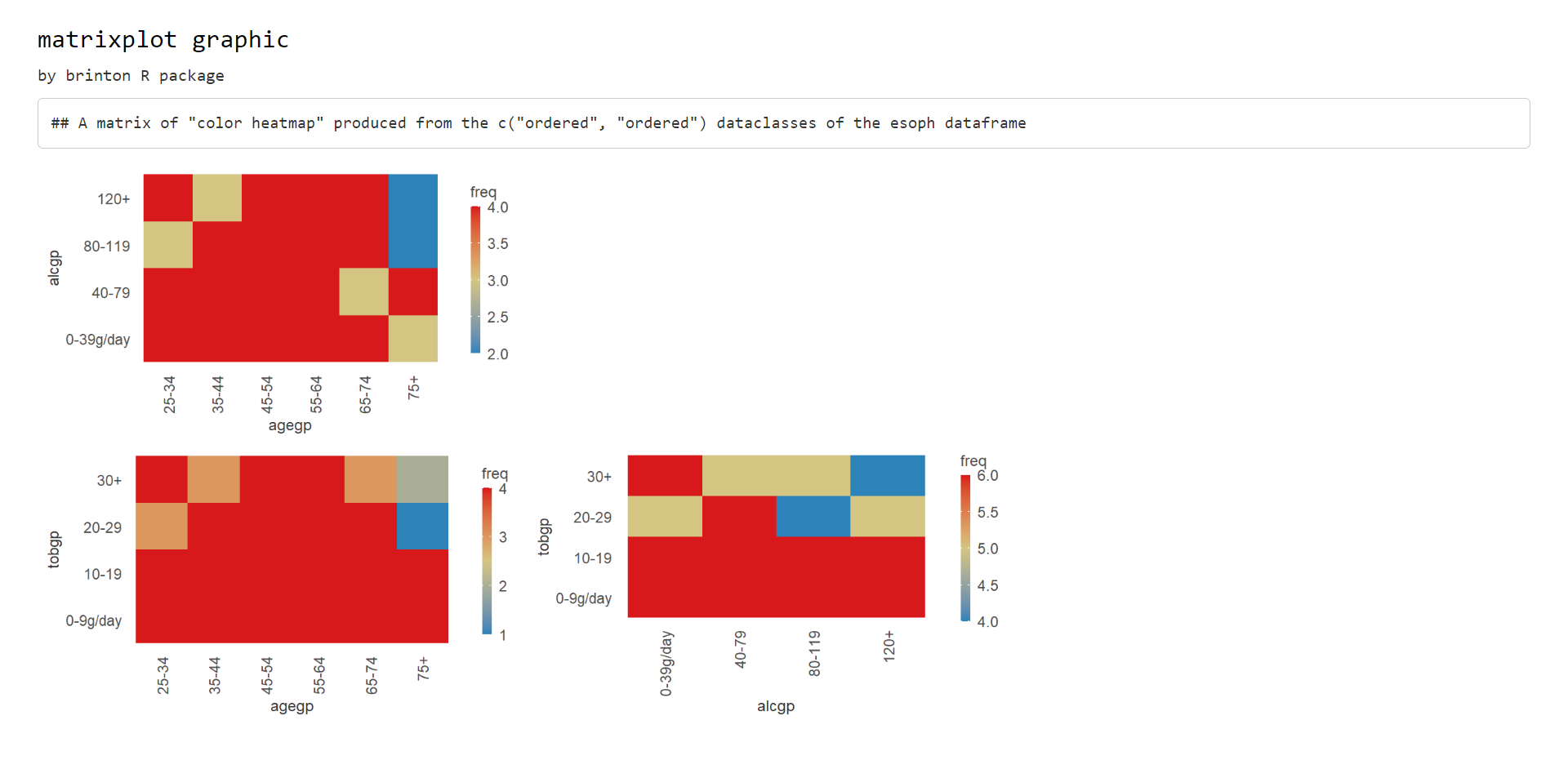
Figure 2
The second scenario occurs if the pairs of variables that are
combined in each panel of the graph are of different classes. This
scenario can only occur when the dataclass argument is a
vector of length 2 with two different variable classes, eg
dataclass = c('numeric', 'factor'). In this case, the
resulting graph matrix is a rectangular matrix in which the columns
represent variables of one type and the rows of the other type (see
figure 3).
matrixplot(esoph, dataclass = c("numeric", "ordered"), diagram = c("box plot"))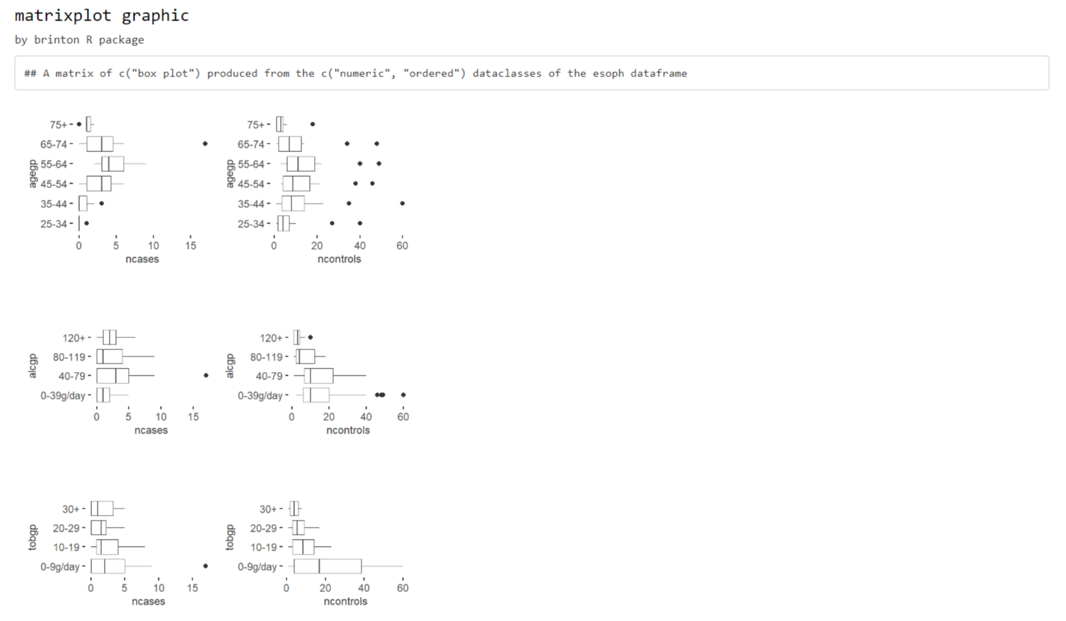
Figure 3
The longplot function
To facilitate economy of calculation, the wideplot()
function presents a limited number of graphics in each row. If the user
wants to expand the array of suggested graphics for a given variable, he
or she should use the longplot() function, which returns a
grid with all of the graphics considered by the library for that
variable (see figure 4). The structure of the function is very simple
longplot(data, vars, label = TRUE) and we can easily check
the outcome of applying this function to the variable alcgp
of the dataset esoph:
longplot(esoph, 'alcgp')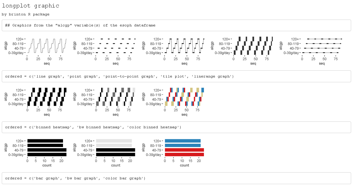
Figure 4
The arguments of the function are data, which must be a
data-frame class object; vars, which requires
the name of a specific variable of the dataset; and label,
which does not have to be defined and which adds a vector below each row
of the grid indicating the name of each graphic. Unlike the grid of the
wideplot() function, the grid of the
longplot() function does not include parameters to limit
the array of graphics to be presented. We made this decision because the
main advantage of this function is precisely that it presents all of the
graphic representations available for a given variable. However, we do
not rule out adding filters that limit the number of graphics to be
shown if this feature seems useful as the catalog fills with graphics.
Each graphic presented can be called explicitly by name using the
functions wideplot() and plotup(), which is
why the argument label has been set to TRUE in
this case.
The array of graphics that the longplot() function
returns is sorted so that in the rows we find different graphic types
and in the columns different variations of the same graphic type. This
organization, however, is not absolute and in some cases in order to
compress the results, we find different graphic types in the columns of
the same row.
The plotup function
The plotup() function has the following structure:
plotup(data, vars, diagram, output = 'html'). By default,
this function returns an html document with a single
graphic based on a variable from a given dataset and the name of the
desired graphic, from among the names included by the specimen. We can
easily check the outcome of applying this function to produce a line
graph from the variable ncases of the dataset
esoph (see figure 5):
plotup(esoph, 'ncases', 'line graph')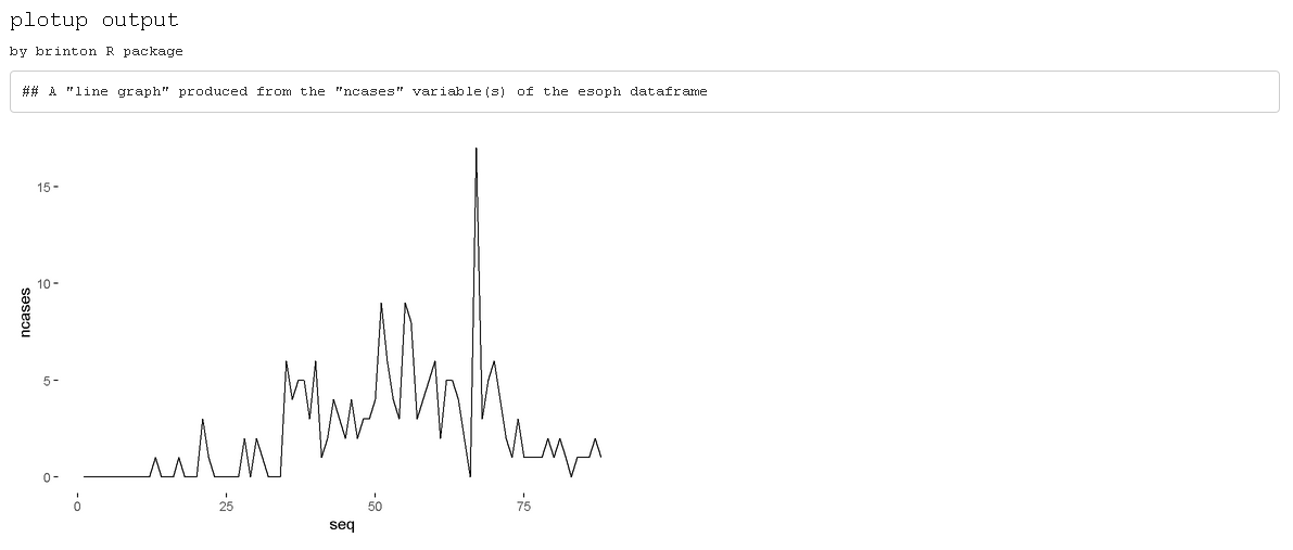
Figure 5
This function requires three arguments: data,
vars and diagram. The fourth argument,
output, is optional and has the default value of
html. However, if it is set to plots pane,
instead of generating a graphic in an html page, it
generates a graphic in the plots pane of RStudio. If, instead, it is set
to ’’console´´, the function returns the code used by the library to
generate this precise graphic. This feature is especially useful to
adapt the default graphic to the specific needs and preferences of the
user.
plotup(data = esoph, vars = 'ncases', diagram ='line graph', output = 'console')
ggplot(esoph, aes(x=seq_along(ncases), y=ncases)) +
  geom_line() +
  labs(x='seq') +
  theme_minimal() +
  theme(panel.grid = element_line(colour = NA),
    axis.ticks = element_line(color = 'black'))